Create a Chart
You can use Flows to create different types of visualizations such as Line charts, Bar charts, Pie charts, Polar area charts, and Radar charts.
User Scenario
Review the following scenario for creating a Line chart using Flows Manager.
In a food processing plant, engineers need to monitor and optimize refrigeration units. They can create a line chart visualization with two lines: one showing the temperature in Celsius and the other converting these readings to Fahrenheit. This real-time chart helps in maintaining precise temperature control, which is critical for food safety standards. Such visualization helps in quick decision-making if temperatures deviate from the desired range, ensuring product quality and regulatory compliance.
Step 1: Create the Chart
To create a temperature conversion line chart:
- In Litmus Edge, navigate to the Flows Manager and create a new flow. See Create a Flow to learn more.
Drag a Datahub Subscribe node, two Function nodes, and a Chart node to the canvas and wire them together.
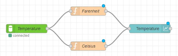 Flows canvas with chart node
- Double-click the Datahub Subscribe node. The Edit Datahub Subscribe node dialog box appears.
- Datahub: Configure the Datahub connection if needed. See the Step 3: Configure Connector Nodes section in Create a Flow to learn more.
- Topic: Enter Fahrenheit.
- Name: Enter Temperature.
Click Done.
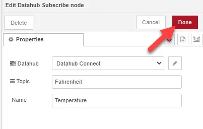 Edit Datahub Subscribe node dialog box
- Double-click one of the Function nodes. The Edit function node dialog box appears.
- Name: Enter Farenheit.
- On Message: Enter the following lines of code to return the temperature in Fahrenheit: msg.topic = 'Fahrenheit '; // Defines the variable return msg;
Click Done.
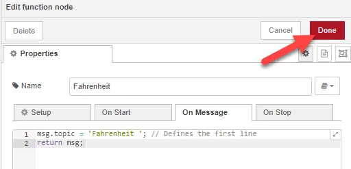 Edit function node dialog box
- Double-click the other Function node. The Edit function node dialog box appears.
- Name: Enter Celsius.
- On Message: Enter the following lines of code to return the temperature in Celsius: var faren = msg.payload; // Temperature from the device in Fahrenheit. var cel = parseFloat(5 / 9 * (parseInt(faren) - 32)).toFixed(2); // Converts Fahrenheit to Celsius up to two decimal places. msg.payload = cel; // Sets the display value on the chart to be our Celsius calculation. msg.topic = 'Celsius'; // Gives the name "Celsius" to the second line of the chart. return msg;
Click Done.
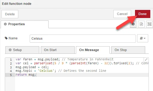 Edit function node dialog box
- Double-click the Chart node. The Edit chart node dialog box appears.
- Label: Enter Temperature.
- Type: Select Line chart from the dropdown option.
- Other Options: There are a number of options for the Chart Types, Labels, Legends, and Series Colours. Feel free to experiment with different options according to your projects.
Group: Click the Edit icon to add a new dashboard group.
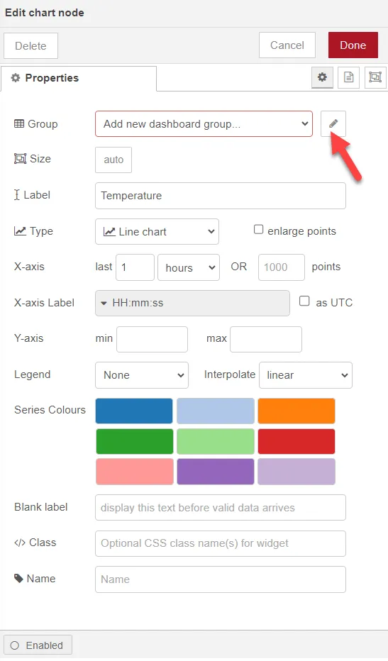 Edit chart node dialog box
- Make the following changes in the Edit dashboard group node dialog box.
- Name: Enter Temperature.
- Display group name: Select the checkbox.
Tab: Click the Edit icon to add a new dashboard tab.
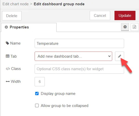 Edit dashboard group node dialog box
- Make the following changes in the Edit dashboard tab node dialog box.
- Name: Enter Temperature.
- Icon: Enter dashboard.
Click Add or Update.
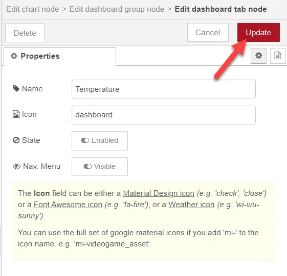 Edit dashboard tab node dialog box
- Click Add or Update from the Edit dashboard group node dialog box. Then click Done from the Edit chart node dialog box and return to the flows canvas.
Add an Inject node, a Function node, and a Datahub Publish node onto the canvas and wire them together.
 Completed flows canvas
- Double-click the Function node. The Edit function node dialog box appears.
- On Message: Enter the following lines of code to generate random float numbers as Fahrenheit temperature. var run = (Math.random() * (86 - 80.75) + 80.75).toFixed(2); //generate random float numbers msg.payload = run; return msg;
Click Done.
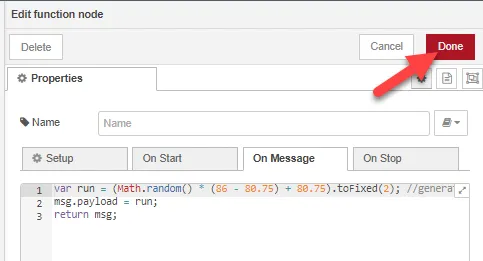 Edit function node dialog box
- Double-click the Datahub Publish node. The Edit Datahub Publish node dialog box appears.
- Datahub: Configure the Datahub connection if needed. See the Step 3: Configure Connector Nodes section in Create a Flow to learn more.
- Topic: Enter Fahrenheit.
- Name: Enter Temperature.
Click Done.
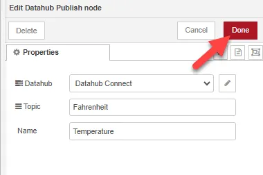 Edit Datahub Publish node dialog box
- Click Deploy.
Step 2: View Line Chart as Output
To view the line chart as output:
Drag the Sidebar up from the bottom of the canvas and select the Dashboard icon.
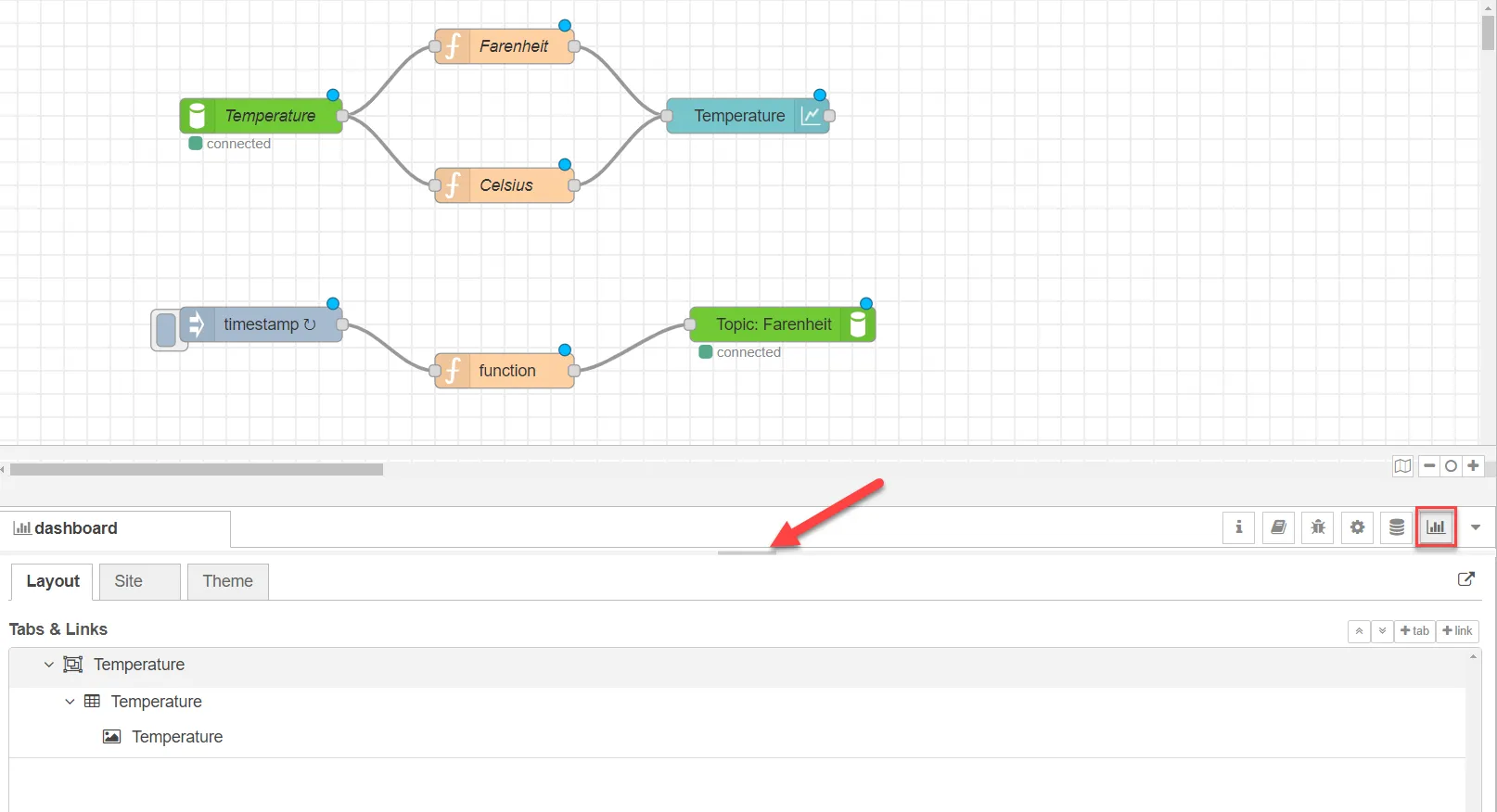 Dashboard icon on flows canvas
You can see the dashboard group and tab you created from the Chart node. Click the Expand icon to view the generated chart in the Node-RED Dashboard browser window.
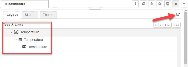 Dashboard expand window
The line chart shows how Fahrenheit temperatures convert to Celsius temperature in real time.
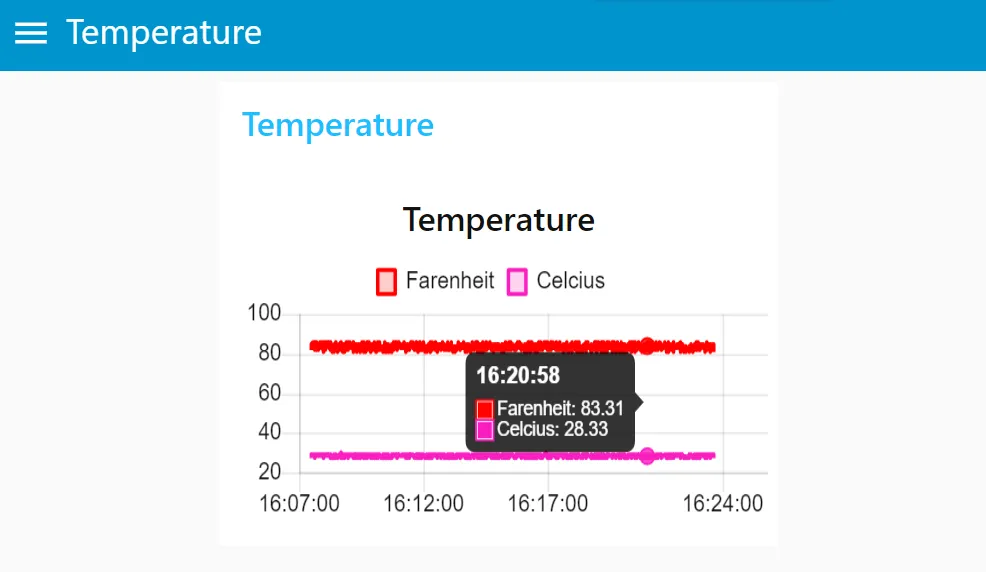 Line chart output
Note: You may need to wait sometime to collect enough data for a proper line chart.